LEAKERS NOTE: This resources is donated by @NahMan!
Original Link: https://www.spigotmc.org/resources/hologui-1-8-x-1-11-2.23451/
Original Link: https://www.spigotmc.org/resources/hologui-1-8-x-1-11-2.23451/
Please Give me a positive rating as a token of appreciation
DONATION: Want more plugins donate any amount to
DONATION: Want more plugins donate any amount to
paypal.me/qtchan
Tested Minecraft Versions: 1.8, 1.9, 1.10, 1.11
Like my stuff and want to donate? Thanks!!

I am no longer doing development on HoloGUI and will no longer be providing support. Please take this into consideration before purchasing.

HoloGUI is a plugin that displays Graphical User Interfaces (GUIs) to players in a whole new, innovative way. HoloGUI allows server owners to create and config entire custom GUI pages to display to their players. Massive configurability means massive possibilities.

demo.antarescraft.com is running v1.10
Design an awesome GUI?
Post screen shots, links to the config files on pastebin.com, and other requirements in the discussion section. Your work may get featured on the plugin page!
BungeeCord compatible!
/server <server_name> does work, making HoloGUI great for designing your server's own custom server selection GUI!
Please don't hesitate to reach out for support! I am very responsive towards any issues that might arise!
Requires:
- Spigot v1.9.*
- For 1.8.*: ProtocolLib v3.6.5, For 1.9.* Protocol Lib v4.01
- PlaceholderAPI
Want your GUI on this list? Post pix of your GUIs in the plugin discussion!
User Created GUIs:
By: @ilturco
For a list of valid PlaceholderAPI placeholders click here.
PlaceholderAPI Setup Tutuorial:
PLEASE READ: If these steps aren't followed the placeholders in the provided examples won't get evaluated!
PlaceholderAPI placeholders are kept as separate extensions and need to be downloaded. Here's how to download and install them:
First run command:
/papi enablecloud
These are the placeholders you need to download in order for the provided example config files to work (You also need Towny, Vault, and McMMO installed in order for the towny, valut, and mcmmo placeholder to get evaluated!):
/papi ecloud download Server
/papi ecloud download Player
/papi ecloud download Towny
/papi ecloud download McMMO
/papi ecloud download Vault
You can browse the list of available placeholders with:
/papi ecloud list all <page>
If you see an extension you like you can download it the same way you did above with: /papi ecloud download <extension_name>
After you've downloaded all of the extensions you want, run:
/papi reload
All placeholders should now evaluate to their correct values
A list of all MVdW Placeholders can be found here
MVdW Placeholders Setup Tutorial
- Download and install MVdWPlaceholderAPI
- Have one of MVdW's placeholder plugins installed (FeatherBoard, DynamicSigns, etc.)
- run command /papi ecloud download mvdw
- run command /papi reload
- Insert the mvdw placeholders with the format %mvdw_<mvdw-placeholder>%
Pl3xIcons Tutorial:
- Make sure you have the resource pack included with Pl3xIcons installed
- Go to http://pl3xicons.mvdw-software.com/
- Select whatever icons you want
- Click the "Translate" button.
- Copy the outputted character into your label text in your gui-page config file
- Run command /hg reloadconfig
- Done. Enjoy your Pl3xIcons!
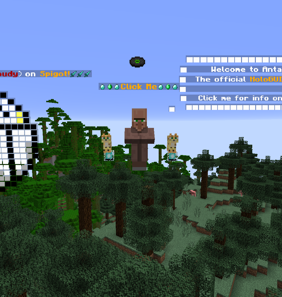

/hg - Author, Version, Website
/hg help - Displays all HoloGUI commands
*requires permission: hg.admin
/hg reloadconfig - Reloads the config file values
/hg guipagelist [page] Displays a list of defined GUI pages
*requires permission: hg.see
/hg open <gui-page-id> - Opens the specified GUI page for the player
/hg close - Closes the GUI page the player is currently looking at
/hg back - Closes the current GUI page the player is looking at and opens the previous GUI page the player was looking at
/hg staticguidisplaylist [page] Displays a list of defined static GUI displays
*requires permission: hg.static
/hg newstaticgui <static-gui-display-id> <gui-container-id> Creates a new static GUI display with the given <static-gui-display-id> at the location the player is standing and displays GUI page <gui-page-id>
/hg deletestaticgui <static-gui-display-id> Deletes the specified static gui display
*requires permission: hg.teleport
/hg tpstaticgui <static-gui-display-id> Teleports the player to the specified static GUI display's location

Configuration files for HoloGUI are located in folder:
plugins/HoloGUI/gui configuration files
Example config files have been supplied in the gui configuration files folder.
You can also access these example config files on pastebin:
QUICK REFERENCE: For Minecraft v1.9-v1.10:
QUICK REFERENCE: For Minecraft v1.8:

- Each different GUI page is broken up into different configuration .yml files in the gui configuration files folder.
- GUI pages act as containers that hold all the different GUI components that will exist on that page.
Code:
example-page:                              #This is the id of your gui page. This id must be distinct among all of your gui-pages.
  open-with-item-id: DIAMOND_SWORD         #Opens this GUI page if the player left clicks while holding the specified item. Make sure to choose a valid Material Type for your Minecraft version. Valid Material Types for Minecraft v1.8 and 1.9 are listed above
  open-with-item-name: "Example Menu"      #Opens this GUI page if the player left clicks with an item with material <open-with-item-id> and the item has the specified name (Default: none)
  open-on-login: true                      #Opens this GUI page when the player logs into the server (Default: false)
  show-permission: "example.permission"    #The permission that the player must have in order to view this gui page (Default: none)
  hide-permission: "example.permission2"   #If this player has the specified permission, then they cannot view this gui page (Default: none)
  components:                              #The components property holds the list of contained GUI components

    #These are just example label components just to show how components fit into the 'components' property of the gui page. (A full explanation on gui components is coming up)
    example-component-1:
      type: label
      text:
        - "This is an example"
      position:
        x: 0
        y: 0

    example-component-2:
      type: label
      text:
        - "This is an example 2"
      position:
        x: 0
        y: -0.1
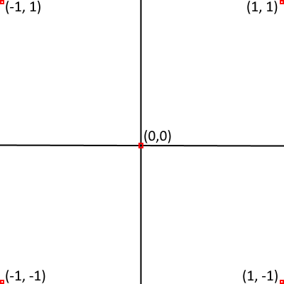
- Each GUI Component has to be given a position in order for the plugin to know where to display that component.
- The 'position' property is shared by all GUI Components. It contains an 'x' and 'y' value.
- x and y are values between -1 and 1
*(0,0) is right in the middle of the player's field of view

- GUI Components are the actual elements that get displayed on the GUI page
- There are several different types of GUI Components, each with their own unique properties that can be configured


- The Label Component is a text only component
- Label Components accept PlaceholderAPI placeholders and Minecraft formatting codes
Code:
  example-label-component:                                      #This is the id of the GUI Component. It must be distinct among all the other GUI Components in the containing GUI page
    type: label                                                 #Specify the 'type' property as 'label' to create a label
    label-distance: 6                                           #How many blocks away the label for this component will be. Default(Button: 15, Item: 6, Entity: 8, Label: 10. Min: 5, Max: 20)
    text:                                                       #The list text to be displayed by this label component
      - "Welcome %player_name% to %server_name%"                #You can use PlaceholderAPI placeholders to display customized messages
      - "%scroll%This is an example of scrolling text"          #Add %scroll% to the beginning of your text to make that line of text scroll
      - "&6&lYou can also use Minecraft text formatting codes to format your text!"
    position:                                                   #Take a look at the Coordinate System section for more information on position. (Default: x: 0, y:0)
      x: 0
      y: 0.2
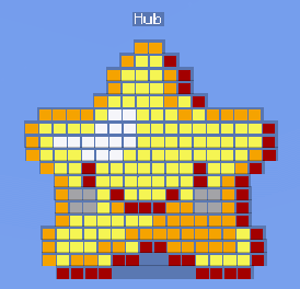
- The button component is a clickable image
Code:
    example-btn:                                                   #id of the button component. It must be distinct among all the other GUI Components in the containing GUI page.
      type: button                                                 #Specify the 'type' property as 'button' to create a button
      label: Example Button                                        #Text label shown above the button
      label-distance: 6                                            #How many blocks away the label for this component will be. Default(Button: 15, Item: 6, Entity: 8, Label: 10. Min: 5, Max: 20)
      label-zoom-distance: 4                                       #When a button is hovered over, how far the label of the button zooms in (Min: 0, Max: 6, Default: 4)
      always-show-label: false                                     #Specify whether to always show the button label or only when the player hovers over it (Default: false)
      icon: example.png                                            #Icons are located in plugins/HoloGUI/images. You can drop your own images in this folder to be displayed on the button.Accepts .jpg, .png, and .gif image formats.
      mini: false                                                  #Button components come in two sizes: regular size (18x18px) and mini (9x9px) (Default: false)
      onclick: "say %player_name% You clicked this button!"        #This is the command to run when the player clicks the button. You can insert PlaceholderAPI placeholders into the command
      execute-command-as-console: true                             #By default HoloGUI runs the onclick command as if it were coming from the player. If 'execute-command-as-console' is true, then the command will run as if the console executed the command (Default: false)
      onclick-sound: UI_BUTTON_CLICK                               #The sound to play when the button is clicked. Make sure to choose the correct sound for your Minecraft version. SoundTypes for v1.8 and v1.9 are listed above (Default: none)
      onclick-sound-volume: 0.7                                    #The volume of the onlclick-sound. Values range from 0-1. 0 Being quiet, 1 being loud (Default: 0.5)
      symmetrical: false                                           #Whether or not the image is symmetrical. This is used to get rid of spacing around the image. (Default: false)
      click-pemission: "example.permission"                        #The permission the player must have to click this button (Default: none)
      no-permission-message: "&4Sorry! You don't have permission!" #The message to display to the player if they don't have the click-permission
      position:                                                    #Take a look at the Coordinate System section for more information on position. (Default: x: 0, y:0)
        x: -0.3
        y: -0.1
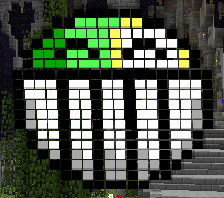
- The Image Component is a non-clickable image
- Width and Height of the image can be specified (unlike the Button Component)
Code:
    example-image:                                                #id of the image component. It must be distinct among all the other GUI Components in the containing GUI page.
      type: image                                                 #Specify the 'type' property as 'image' to create an image
      label: Example Image                                        #Text label shown above the image
      always-show-label: true                                     #Specify whether to always show the image label
      image-src: image.png                                        #Images are located in plugins/HoloGUI/images. You can drop your own images in this folder to be displayed on the image. Accepts .jpg, .png, and .gif image formats.
      width: 20                                                   #Width of the image (Default: 18)
      height: 20                                                  #Height of the image (Default: 18)
      symmetrical: false                                          #Whether or not the image is symmetrical. This is used to get rid of spacing around the image. (Default: false)
      position:                                                   #Take a look at the Coordinate System section for more information on position. (Default: x: 0, y:0)
        x: -0.3
        y: -0.1
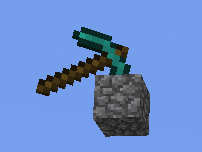
- The Item Component displays an item at the specified position
- It can be either clickable or non-clickable depending on the value of the 'clickable' property.
- Item Components have an extra property called 'rotation', in which the rotation of the item about the x, y, and z axis can be specified
Code:
    example-item:                                                #id of the item component. It must be distinct among all the other GUI Components in the containing GUI page.
      type: item                                                 #Specify the 'type' property as 'item' to create an item
      item-id: DIAMOND_SWORD:0                                   #The MaterialType of the item. If you want to specify a data value, add ':<data-value'> to the end of the item-id. Make sure to choose a valid Material Type for your Minecraft version. Valid Material Types for Minecraft v1.8 and 1.9 are listed above
      label: Example Item                                        #Text label shown above the item
      label-distance: 6                                          #How many blocks away the label for this component will be. Default(Button: 15, Item: 6, Entity: 8, Label: 10. Min: 5, Max: 20)
      label-zoom-distance: 4                                     #When a button is hovered over, how far the label of the button zooms in (Min: 0, Max: 6, Default: 4)
      always-show-label: true                                    #Specify whether to always show the item label (Default: false)
      clickable: true                                            #Specify if this item component is clickable or not (default: false)
      onclick: "say %player_name% You clicked this item!"        #When the 'onclick' property is specified, the item becomes clickable. This is the command to run when the player clicks the item. You can insert PlaceholderAPI placeholders into the command
      execute-command-as-console: true                           #By default HoloGUI runs the onclick command as if it were coming from the player. If 'execute-command-as-console' is true, then the command will run as if the console executed the command (Default: false)
      onclick-sound: UI_BUTTON_CLICK                             #The sound to play when the button is clicked. Make sure to choose the correct sound for your Minecraft version. SoundTypes for v1.8 and v1.9 are listed above (Default: none)
      onclick-sound-volume: 0.7                                  #The volume of the onlclick-sound. Values range from 0-1. 0 Being quiet, 1 being loud (Default: 0.5)
      click-pemission: "example.permission"                      #The permission the player must have to click this button (Default: none)
      no-permission-message: "&4Sorry! You don't have permission!"#The message to display to the player if they don't have the click-permission
      rotation:                                                  #The rotation of the item around the x, y, and z axis in degrees. Values range from -360 to 360. (Default: x:0, y:0, z:0)
        x: 0
        y: 90
        z: 0
      position:                                                  #Take a look at the Coordinate System section for more information on position. (Default: x: 0, y:0)
        x: -0.3
        y: -0.1
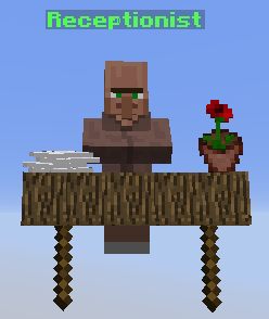
- The Entity Component spawns the specified entity at the given position
- It can be either clickable or non-clickable depending on the value of the 'clickable' property.
- Entity Components have an extra property called 'yaw' which specifies the entity's yaw (rotation around the y-axis)
Code:
    example-entity:                                                #id of the entity component. It must be distinct among all the other GUI Components in the containing GUI page.
      type: entity                                                 #Specify the 'type' property as 'entity' to create an entity
      entity-type: VILLAGER                                        #The EntityType of the component. Make sure to choose a valid Entity Type for your Minecraft version. Valid Entity Types for Minecraft versions 1.8 and 1.9 are listed above
      label: Example Entity                                        #Text label shown above the entity
      label-distance: 6                                            #How many blocks away the label for this component will be. Default(Button: 15, Item: 6, Entity: 8, Label: 10. Min: 5, Max: 20)
      label-zoom-distance: 4                                       #When a button is hovered over, how far the label of the button zooms in (Min: 0, Max: 6, Default: 4)
      always-show-label: true                                      #Specify whether to always show the entity label (Default: false)
      clickable: true                                              #Specify if this entity component is clickable or not (default: false)
      onclick: "say %player_name% You clicked this entity!"        #When the 'onclick' property is specified, the entity becomes clickable. This is the command to run when the player clicks the entity. You can insert PlaceholderAPI placeholders into the command
      execute-command-as-console: true                             #By default HoloGUI runs the onclick command as if it were coming from the player. If 'execute-command-as-console' is true, then the command will run as if the console executed the command (Default: false)
      onclick-sound: UI_BUTTON_CLICK                               #The sound to play when the button is clicked. Make sure to choose the correct sound for your Minecraft version. SoundTypes for v1.8 and v1.9 are listed above (Default: none)
      onclick-sound-volume: 0.7                                    #The volume of the onlclick-sound. Values range from 0-1. 0 Being quiet, 1 being loud (Default: 0.5)
      click-pemission: "example.permission"                        #The permission the player must have to click this button (Default: none)
      no-permission-message: "&4Sorry! You don't have permission!" #The message to display to the player if they don't have the click-permission
      yaw: 0                                                       #The yaw of the entity in degrees. Values range from -360 to 360 (Default: 0)
      position:                                                    #Take a look at the Coordinate System section for more information on position. (Default: x: 0, y:0)
        x: -0.3
        y: -0.1
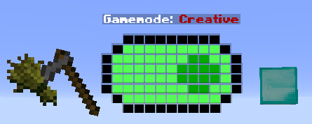
- The Toggle Switch Component creates a component that can have two states: true and false
- Clicking the toggle switch causes it to swap states
- Toggle switches can have a value. The value can be accessed with the placeholder: %<toggle-switch-id>_value%.
Code:
  example-toggle-btn:                                               #Id of the toggle switch
    type: toggle-switch                                             #Set type to 'toggle-switch' to create a new toggle switch component
    label: "&lGamemode: &4&l%example-toggle-btn_value%"             #Label of the toggle switch
    always-show-label: true                                         #Specify whether to always show the entity label (Default: false)
    value: false                                                    #Specify true|false to set the default value the toggle switch starts with
    icon-on: default-toggle-on.png                                  #The image to use when the toggle switch is in the 'on' state
    on-value: Creative                                              #Assign a value that this toggle switch will have when in the 'on' state. The current value of the toggleswitch can be accessed with placeholder %component-id_value%
    onclick-on: gamemode 1 %player_name%                            #Command to run when the toggle button gets toggled to 'true'
    execute-onclick-on-as-console: true                             #Execute the on-command as console or not (true|false)
    icon-off: default-toggle-off.png                                #The image to use when the toggle switch is in the 'off' state
    off-value: Survival                                             #Assign a value that this toggle switch will have when in the 'off' state. The current value of the toggleswitch can be accessed with placeholder %component-id_value%
    onclick-off: gamemode 0 %player_name%                           #Command to run when the toggle button gets toggled to 'false'
    execute-onclick-off-as-console: true                            #Execute the off-command as console or not (true|false)
    onclick-sound: UI_BUTTON_CLICK                                  #The sound to play when the button is clicked. Make sure to choose the correct sound for your Minecraft version. SoundTypes for v1.8 and v1.9 are listed above (Default: none)
    click-pemission: "example.permission"                           #The permission the player must have to click this button (Default: none)
    no-permission-message: "&4Sorry! You don't have permission!"    #The message to display to the player if they don't have the click-permission
    position:                                                       #Take a look at the Coordinate System section for more information on position. (Default: x: 0, y:0)
      x: 0
      y: -0.25

- The text box component is directly editable in game
- Click the text box once to edit the text box
- Click the text box again to cancel editing the text box
- Type the text you want to appear in the textbox in chat after you have began editing
- After typing the text into chat and pressing 'Enter' the textbox will update.
%<text-box-id>_value%
Code:
  text-box-example:
      type: text-box                                                    #Id of the text box
      always-show-label: true                                           #Specify whether to always show the entity label (Default: false)
      label: "&lText Box Value: %text-box-example_value%"               #Label of the text box
      default-text: "Insert a command..."                               #Default text to appear in the textbox
      onclick-sound: UI_BUTTON_CLICK                                    #The sound to play when the textbox is clicked. Make sure to choose the correct sound for your Minecraft version. SoundTypes for v1.8 and v1.9 are listed above
      click-pemission: "example.permission"                             #The permission the player must have to click this button (Default: none)
      no-permission-message: "&4Sorry! You don't have permission!"      #The message to display to the player if they don't have the click-permission
      position:                                                         #Take a look at the Coordinate System section for more information on position. (Default: x: 0, y:0)
        x: 0
        y: 0.3
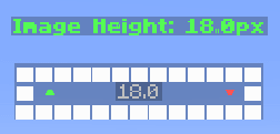
The Value Scroller Component is a component that allows the user to use the mouse wheel to scroll between a range of different values. Great if you want the user to pick from a predefined range of numbers.
The value of this value scroller can be accessed with placeholder:
%<value-scroller-id>_value%
Value Scroller Config:
Code:
value-scroller-example:                                           #Id of the value scroller
      type: value-scroller                                        #Specify the type as 'value-scroller' to create a Value Scroller Component
      always-show-label: true                                     #Specify whether to always show the label (Default: false)
      label: "&lScroller Value: %value-scroller-exmaple_value%"   #Label of the value scroller
      default-value: 10                                           #Default value this value scroller will have
      min-value: 0                                                #Minimum value this value scroller can have
      max-value: 20                                               #Maximum value this value scroller can have
      decimal-format: "#.##"                                      #The decimal format of the number displayed in the value scroller
      step: 1                                                     #The value that will be add/subtracted from the current value as the player scrolls
      onscroll-sound: "BLOCK_LAVA_POP"                            #The sound the plays when the user scrolls
      onscroll-sound-volume: 0.1                                  #The volume of the onscroll sound (0 being softest, 1 being loudest)
      onclick-sound: UI_BUTTON_CLICK                              #The sound to play when the value scroller is clicked. Make sure to choose the correct sound for your Minecraft version. SoundTypes for v1.8 and v1.9 are listed above
      click-pemission: "example.permission"                       #The permission the player must have to click this button (Default: none)
      no-permission-message: "&4Sorry! You don't have permission!"#The message to display to the player if they don't have the click-permission
      position:                                                   #Take a look at the Coordinate System section for more information on position. (Default: x: 0, y:0)
        x: 0
        y: 0.3
hg.* - Access to all HoloGUI commands and features (Default: op)
hg.admin - Access to all HoloGUI admin commands (Default: op)
hg.see - Gives the player the ability to see GUI pages (Default: true)
hg.static - Gives the player the ability to create static GUI displays (Default: op)
hg.teleport - Allows the player to teleport to a static display (Default: op)

*By purchasing HoloGUI you agree to the following conditions:
- Do NOT -Redacted- the plugin. If a copy of the plugin tied to your user account is found leaked online, you run the risk of it being disabled, barring you from receiving working future updates. You will always have access to HoloGUI v1.3.2 and back.
- Do NOT decompile HoloGUI and post the source code in a publicly accessible place (like a public Git repository). You may upload the source to a private Git repo for your personal use only.
- You may modify the source for personal use.
- Do NOT modify the source and then -Redacted- the modified jar.
